Design a stunning, brand-consistent widget interface with advanced theme customization tools and visual styling options
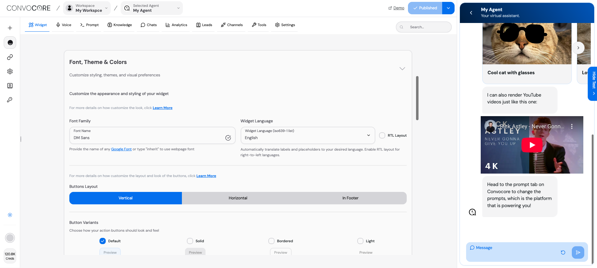
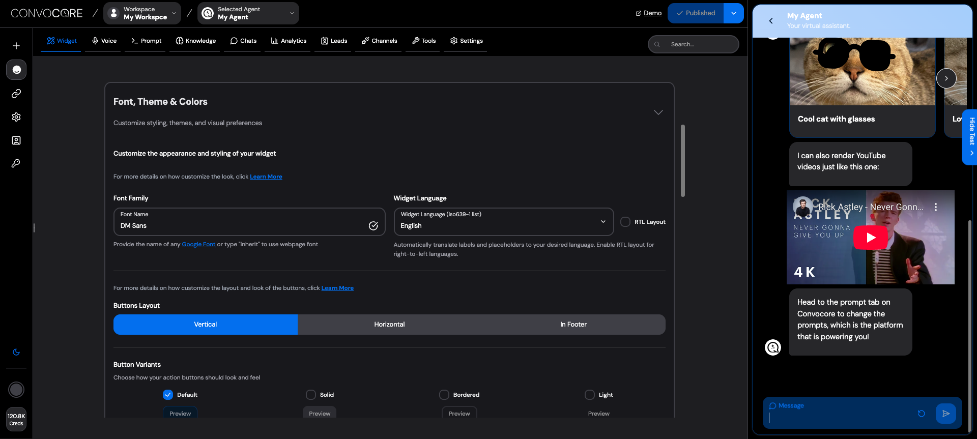
Create a visually stunning widget that perfectly matches your brand identity. The Theme Customization feature provides powerful tools to control every aspect of your widget’s appearance, from colors and fonts to layouts and images.
Font Options:- Any Google Font name (e.g., "Roboto", "Open Sans", "DM Sans")- "inherit" - Use your website's existing font- Custom web fonts (via CSS import)
Popular Professional Fonts:
DM Sans - Modern, clean (default)
Inter - Highly readable, tech-focused
Poppins - Friendly, approachable
Roboto - Google’s flagship, versatile
Avoid “inherit” unless you’re certain your website font loads properly in the widget context
Language & Localization
Automatic Translation
50+ supported languages
Auto-translates labels and placeholders
Maintains context and meaning
Right-to-left (RTL) support
Custom Translations
Override auto-translations
Brand-specific terminology
Cultural adaptations
Regional dialects
Button Layout Options
Vertical Layout
Horizontal Layout
Footer Layout
Best For:
✅ Mobile-first designs
✅ Limited horizontal space
✅ Clean, stacked appearance
✅ Easy thumb navigation
Best For:
✅ Desktop-focused interfaces
✅ Quick action accessibility
✅ Compact widget designs
✅ Traditional web layouts
Launch Avatar
Purpose: The main icon users see before opening your widgetSpecifications:
Size: 64x64px minimum
Format: PNG, JPG, WebP
Max size: 0.5MB
Best Practices:
Use your logo or brand icon
Ensure good visibility at small sizes
Consider contrast with your website background
Header Image
Purpose: Top banner in your widget headerSpecifications:
Aspect ratio: 16:9 or 3:1
Format: PNG, JPG, WebP
Max size: 0.5MB
Best Practices:
Brand logos or hero graphics
Keep text minimal (may not be readable)
Optimize for both light and dark themes
Banner Image
Purpose: Full-width promotional or branding imageSpecifications:
Width: 600px minimum
Format: PNG, JPG, WebP
Max size: 0.5MB
Use Cases:
Product showcases
Promotional banners
Brand storytelling
Chat Avatar
Purpose: Icon representing your AI agent in conversationsSpecifications:
Size: 40x40px minimum
Format: PNG, JPG, WebP
Max size: 0.5MB
Design Tips:
Professional headshot or mascot
Friendly, approachable appearance
Consistent with brand personality
Background Chat Image Configuration
Background Image Options
• Light textures
• Geometric patterns
• Brand watermarks
• Busy, distracting images
• High contrast backgrounds
• Text-heavy graphics
Visibility Controls
Completely Visible: Background shows fully
Subtle Overlay: Semi-transparent for readability
Hidden: No background image
Image Management
Reset to Default: Use platform default
Custom Upload: Your own image
Remove: Clean, minimal background
Preset Themes
Custom Color Palette
Blue
Professional, trustworthy, corporate
Purple
Creative, innovative, tech-forward
Cyan
Fresh, modern, healthcare/wellness
Pink
Friendly, approachable, lifestyle
Yellow
Energetic, optimistic, food/travel
Red
Bold, urgent, e-commerce/sales
Dark Mode Configuration
Dark Mode Benefits:
Reduced eye strain in low-light environments
Modern, sophisticated appearance
Better battery life on OLED devices
Popular with tech-savvy users
Test your images and text contrast carefully in dark mode to ensure readability
Primary Color Selection
{ "primary": "#your-brand-color", "auto_generate": true, "theme_type": "light" // or "dark"}