> ## Documentation Index
> Fetch the complete documentation index at: https://docs.convocore.ai/llms.txt
> Use this file to discover all available pages before exploring further.
# Designing Your Agent
> A comprehensive guide on how to design your agent with outstanding and undeniable glow.
 # 1. Overview
The Overview section allows you to customize your agents text to fit your client's branding or your unique style.
# 1. Overview
The Overview section allows you to customize your agents text to fit your client's branding or your unique style.
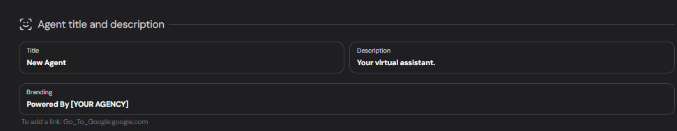 The name of your agent.
Example: `GymBuddy GPT`
A short descriptive statement, information or call to action. Experiment with different descriptions to find out what your customers like the best!
**Examples:**
```markdown 1 theme={null}
Any questions? Im here to help!
```
```markdown 2 theme={null}
Your helpful AI Agent, [Name]!
```
```markdown 3 theme={null}
No. 1 Sneaker store in LA
```
Include branding information and links if necessary.
Example:
```
⚡Powered by [YOUR AGENCY]⚡
```
To add a link, use a colon behind the word you want to hyperlink:
```
⚡Powered by YOUR AGENCY:youragency.com⚡
```
# 2. Appearance
Customize the look and feel of your agent to match your brand.
The name of your agent.
Example: `GymBuddy GPT`
A short descriptive statement, information or call to action. Experiment with different descriptions to find out what your customers like the best!
**Examples:**
```markdown 1 theme={null}
Any questions? Im here to help!
```
```markdown 2 theme={null}
Your helpful AI Agent, [Name]!
```
```markdown 3 theme={null}
No. 1 Sneaker store in LA
```
Include branding information and links if necessary.
Example:
```
⚡Powered by [YOUR AGENCY]⚡
```
To add a link, use a colon behind the word you want to hyperlink:
```
⚡Powered by YOUR AGENCY:youragency.com⚡
```
# 2. Appearance
Customize the look and feel of your agent to match your brand.
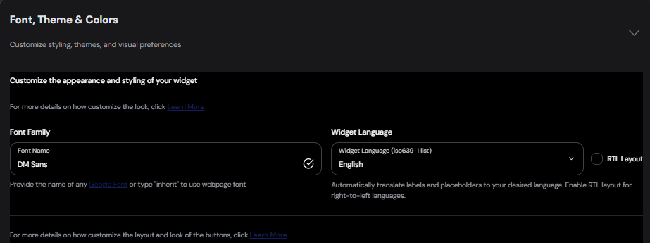 #
**Font family**: Choose from any of the free [Google fonts](Google_font).
Example: `DM Sans`
You can change the fonts of specific parts (like header and input field) using **custom
CSS**.
#
**Inherit Font**: Type "inherit" in the font input field to use the same font as webpage. Note: The widget must be put on the website for this to work.
Not recommended, as this may break the agent – use at your own **risk**.
#
## Widget Language
Convocore uses [ISO 639-1 language codes](https://en.wikipedia.org/wiki/List_of_ISO_639_language_codes) to set the language, this means your widget can have literally **any** language. \*\*Codes are primarily used in the developer API.
Labels and placeholders will be **automatically** translated to your chosen language. `Title` and `branding` will keep their original language and text. Choose ✨**Automatic** to pull website language automatically.
English will be `en`.
#
## Buttons Layout
Customize the layout and look of the buttons used in your agent's interface. There are three options to consider with each unique uses cases. Example, `in footer` or `horizontal` is often used as a way to automatically generate follow up questions (**similar to microsoft co-pilot or perplexity**) to guide the user through the conversation with ease.
#
**Font family**: Choose from any of the free [Google fonts](Google_font).
Example: `DM Sans`
You can change the fonts of specific parts (like header and input field) using **custom
CSS**.
#
**Inherit Font**: Type "inherit" in the font input field to use the same font as webpage. Note: The widget must be put on the website for this to work.
Not recommended, as this may break the agent – use at your own **risk**.
#
## Widget Language
Convocore uses [ISO 639-1 language codes](https://en.wikipedia.org/wiki/List_of_ISO_639_language_codes) to set the language, this means your widget can have literally **any** language. \*\*Codes are primarily used in the developer API.
Labels and placeholders will be **automatically** translated to your chosen language. `Title` and `branding` will keep their original language and text. Choose ✨**Automatic** to pull website language automatically.
English will be `en`.
#
## Buttons Layout
Customize the layout and look of the buttons used in your agent's interface. There are three options to consider with each unique uses cases. Example, `in footer` or `horizontal` is often used as a way to automatically generate follow up questions (**similar to microsoft co-pilot or perplexity**) to guide the user through the conversation with ease.
 Vertical (standard):
 Horizontal layout:
Buttons In footer:
## 3. Launch Avatar
Set the images that will represent your agent visually.
You can either upload an image or provide a valid image link/url. The max size is: 0.5MB
per image. We recommend using a square image with at least 400px x 400px for optimal
clarity.
Image for the chat bubble. Setting this image alone will default to all other images on the widget except background.
Chat icon in the top left corner of the agent.
Display image at the top of the chat.
Main image for the agent's chat messages.
Background for the chat section of the widget (The white area above the input field, behind the main chat). This background has a low default opacity and might not be as visible if the image is very light. Settings can be modified with custom CSS.
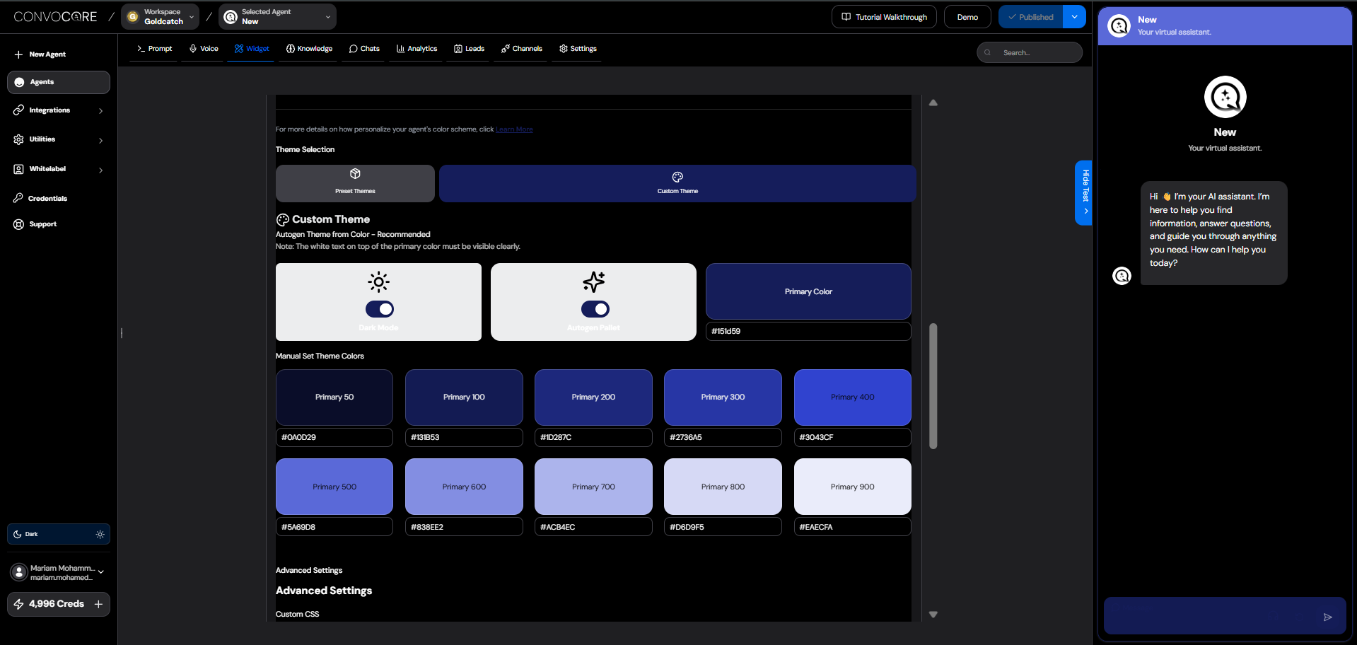
## 4. Custom Theme
Personalize your agent's color scheme to align with your brand.
If youre struggling to find your brands primary color. We recommend dowloading the
chrome/edge plugin [ColorPick
Eyedropper](https://chromewebstore.google.com/detail/colorpick-eyedropper/ohcpnigalekghcmgcdcenkpelffpdolg)
to easily find your preferred color from your website color.
Horizontal layout:
Buttons In footer:
## 3. Launch Avatar
Set the images that will represent your agent visually.
You can either upload an image or provide a valid image link/url. The max size is: 0.5MB
per image. We recommend using a square image with at least 400px x 400px for optimal
clarity.
Image for the chat bubble. Setting this image alone will default to all other images on the widget except background.
Chat icon in the top left corner of the agent.
Display image at the top of the chat.
Main image for the agent's chat messages.
Background for the chat section of the widget (The white area above the input field, behind the main chat). This background has a low default opacity and might not be as visible if the image is very light. Settings can be modified with custom CSS.
## 4. Custom Theme
Personalize your agent's color scheme to align with your brand.
If youre struggling to find your brands primary color. We recommend dowloading the
chrome/edge plugin [ColorPick
Eyedropper](https://chromewebstore.google.com/detail/colorpick-eyedropper/ohcpnigalekghcmgcdcenkpelffpdolg)
to easily find your preferred color from your website color.
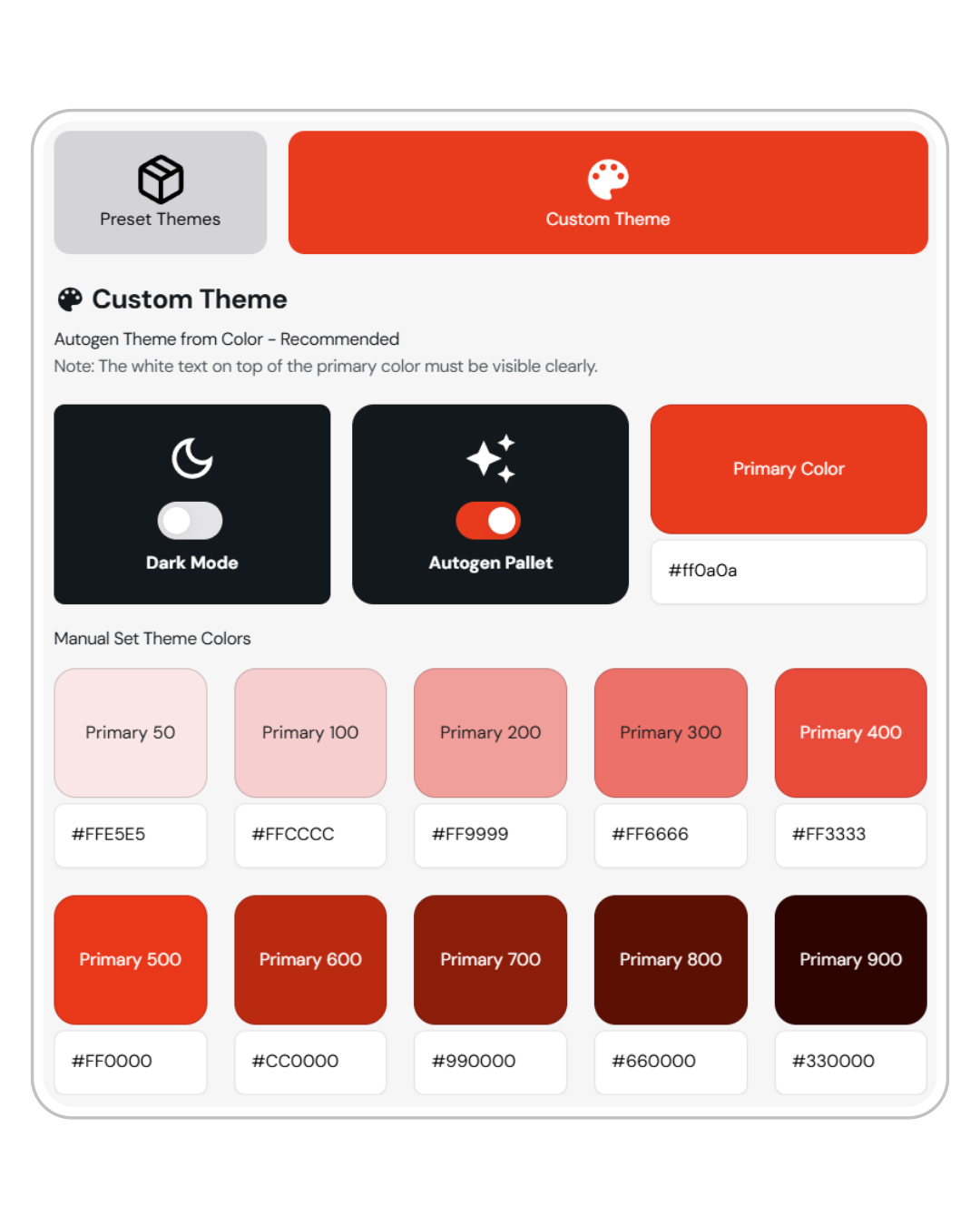 ###
You can choose between six predefined themes that work in both light and dark mode.
You can set your agent to light or dark mode. This is nice if you or your client have darker websites, as the agent will fit right in to the branding.
**Recommended:** Automatically generate a theme based on your primary color.
Visibility Note: Ensure white text on top of the primary color is clearly visible and experiment with all kinds of color combinations.
###
**Custom Colors**: Manually input your theme colors using HEX codes or use the color palettes available in the designer.
Example: `#F34534`
All colors and elements can be modified using custom CSS.
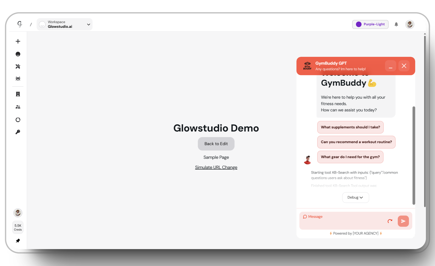
## Showcasing the agent
It's essential to know how the agent behaves and looks before launching on your website or letting a client test it. Convocore has two options for testing, right from the agent designer:
1. Your clients will want to test a demo of their agent. Using the prototype link is a great way to do that. If you are in the whitelabeling program, the link will have your custom domain and branding!
###
You can choose between six predefined themes that work in both light and dark mode.
You can set your agent to light or dark mode. This is nice if you or your client have darker websites, as the agent will fit right in to the branding.
**Recommended:** Automatically generate a theme based on your primary color.
Visibility Note: Ensure white text on top of the primary color is clearly visible and experiment with all kinds of color combinations.
###
**Custom Colors**: Manually input your theme colors using HEX codes or use the color palettes available in the designer.
Example: `#F34534`
All colors and elements can be modified using custom CSS.
## Showcasing the agent
It's essential to know how the agent behaves and looks before launching on your website or letting a client test it. Convocore has two options for testing, right from the agent designer:
1. Your clients will want to test a demo of their agent. Using the prototype link is a great way to do that. If you are in the whitelabeling program, the link will have your custom domain and branding!
 2. It's not always easy to visualize how the agent will look on a website. The demo link lets you test it out in chat bubble format, so you get an idea of how the agent will look your website.
This is also a great way to test out custom CSS styling.
2. It's not always easy to visualize how the agent will look on a website. The demo link lets you test it out in chat bubble format, so you get an idea of how the agent will look your website.
This is also a great way to test out custom CSS styling.
 ### Additional Tips
{' '}
**Save Regularly**: Remember to always save your progress to prevent the loss of your beautiful
designs.
**Thorough Testing**: Test your agent thoroughly to ensure all settings and features
are working as intended.
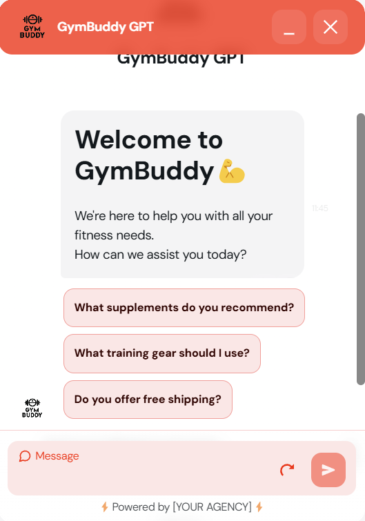
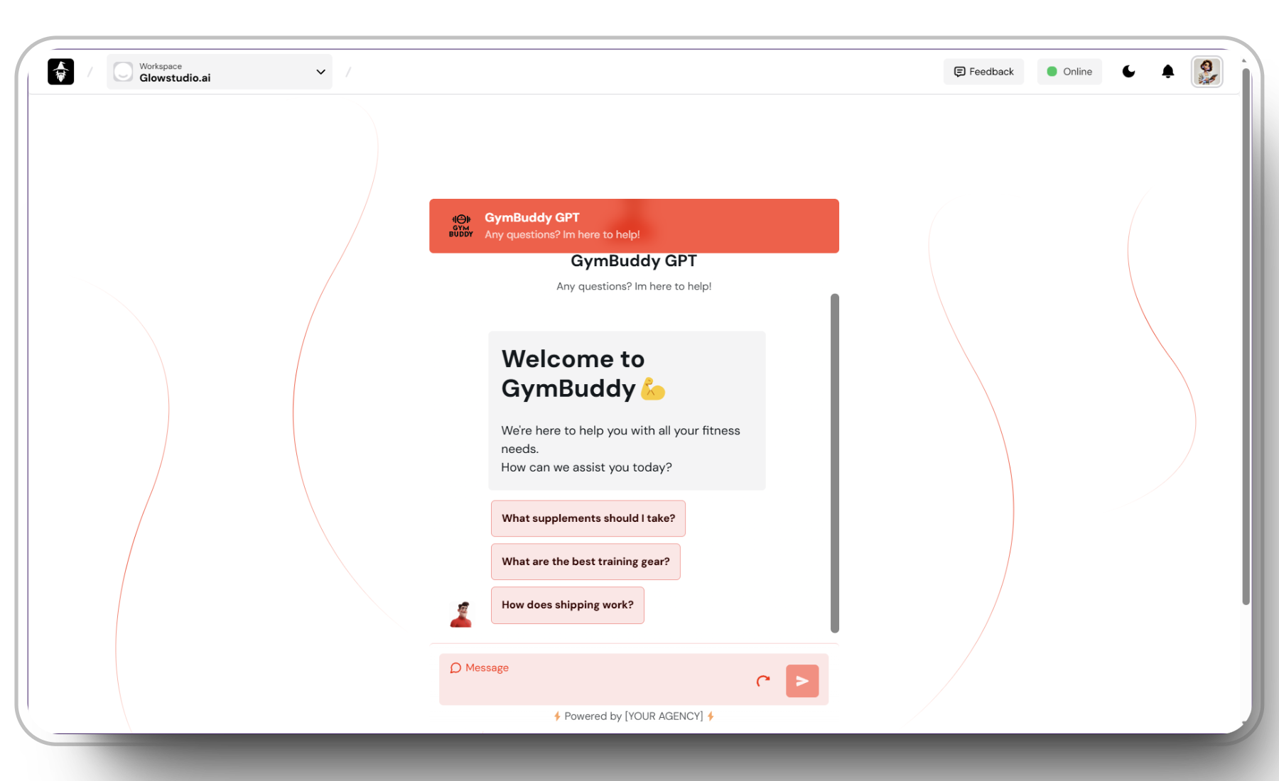
## Example: GymBuddy GPT
Here is the agent used in the guide above. `Give it a try:`
# ## Related docs:
{" "}
### Additional Tips
{' '}
**Save Regularly**: Remember to always save your progress to prevent the loss of your beautiful
designs.
**Thorough Testing**: Test your agent thoroughly to ensure all settings and features
are working as intended.
## Example: GymBuddy GPT
Here is the agent used in the guide above. `Give it a try:`
# ## Related docs:
{" "}